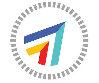
A few months ago, we decided to redesign the ArtAround logo. We’ve spent a lot of time taking a step back to reimagine who we are and what we could be as an organization and a community. We wanted our visual identity to reflect that.
That’s when Angela, our Community and Brand Strategist, introduced us to Shawn Cheris.
Shawn, a graphic designer at Adobe, works on a team that handles everything from the recognizable icon of Photoshop to all of those tools and buttons that we take for granted (they create between 5,000 and 30,000 individual items a year). He’s creative and thoughtful, and we were lucky to work with him.
Now that our new logo is out in cyberspace, we thought we’d let you know how we got here.

Laura Kogler: How did you begin the process of designing ArtAround’s new logo?
Shawn: When you’re designing a logo for something functional like an application, you’re always looking for an opportunity to distill the thing down to its core. What does it do? How does it work? If it’s something that other people are doing, what’s unique or interesting about your version of it? From there I can consider less concrete aspects. How should it feel? What is it’s personality? Is it playful? Is it serious? Who is it for? I also develop lists of words and look for opportunities to combine two or more ideas.
ArtAround is about curation, looking, fun, participation, and exploration. It’s about maps, sculpture, murals, architecture, installations, and cityscapes. When you get down to it, though, the most fundamental thing about it is in the name itself: it shows you where the art is. It’s about wayfinding, directions, and discovery. I thought that the language of maps would probably have something to offer and began collecting a lot of imagery for inspiration.
LK: How did the idea change over time? Which ideas carried through the whole process?
Shawn: I had a lot of ideas in the beginning, but the more I looked at maps, the more I felt that the form of a compass should play a role. An uppercase “A” is very directional, like an arrow. With two A’s in the name I felt like I was going to find a good solution in there somewhere.
I did some early color studies and thought that the logo and the app itself, specifically the map pins, should have a relationship. I also felt that something to do with art should be more colorful and fun. It should feel inviting. The rest of the process was just trying to figure out how to do all of that in one form.
LK: As you were presenting to us, I was struck by the balance of aesthetic design and corporate utility involved in the thought process. Is that a difficult balance to achieve?
Shawn: There’s a school of thought in traditional design where you basically reason your way to the solution. You do a ton of research, lots of sketches, and you find that magic idea. In this way of thinking, the execution of the thing—the form—is just the logical conclusion of the thinking. It’s the last 5%.
There’s another way of working that’s purely formal, where you just start making things, and if something is compelling, you try to figure out why and make more versions of it. The idea is that your instincts as a designer are actually pretty good and in the end, you’ll find meaning in the form. Or maybe the form is meaning.
Each approach has its merits and applications. In my own process, I tend to use both. Often the two meet in the middle. I’d say ArtAround was more about the visuals being directly influenced by the thinking—wayfinding, the double “A”, color, etc. It was just a matter of finding the right balance.
LK: How do you think the logo turned out?
Shawn: A great logo is not only visually compelling, but operates at a few different levels, has different reads over time, and – most difficult to achieve – has a sense of obviousness about it. It makes you think, “Yes, of course, it had to be that.”
I think we got there with this one. It communicates the function and personality of ArtAround and it looks great. And you guys are happy with it. You can’t ask for more than that.
Thank you, Shawn!
Leave a Reply